We rebranded Tango. Here's what we're doubling down on.

A new look, inspired by you
Today, Tango has a new look - new colors, an updated illustration system, a refreshed logo, and a rebranded homepage that feels like the product you actually use. But this isn't just a fresh coat of paint. It's us doubling down on the reason Tango exists in the first place.
This didn't happen overnight. Dozens of you told us what it looks like to wear multiple hats in your role, how it feels to often put others’ requests above your own work, and what training and onboarding used to look like. For some, it showed up as frustration from being the go-to person.
“Trying to train 200 people without SOPs is a fast track to losing your mind. Slack gets useless fast.”
For others, it wasn't about frustration at all. Charles, a manager at a home services company put it simply: “It's more that we're just growing. So as we're growing, we're making sure everything's lined out.” Either way, you carried that weight — whether you were drowning in repeat questions or just trying to keep pace with a team that was scaling fast.
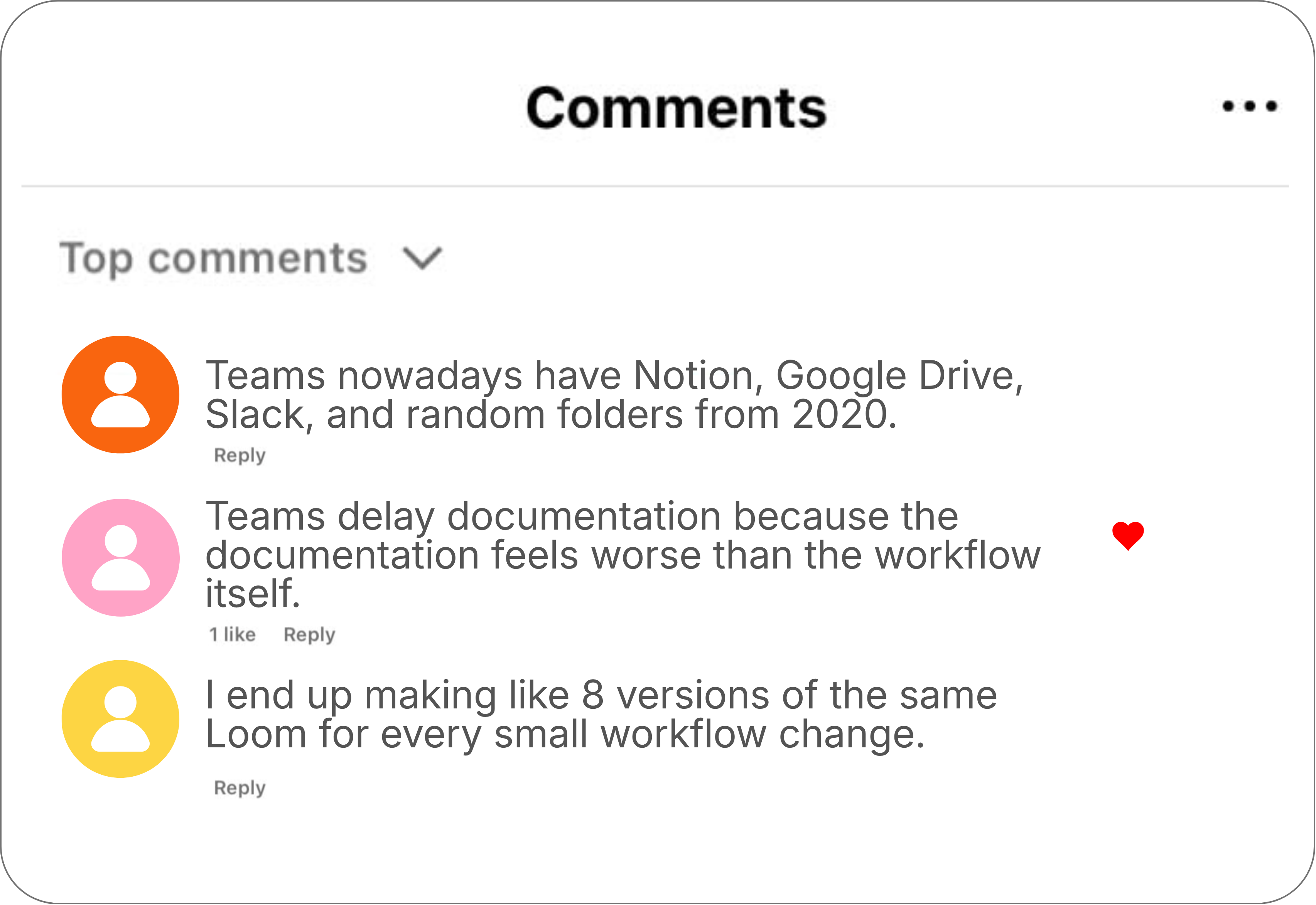
We also read through hundreds of in-the-wild comments you wrote about your tech stack annoyances, and how overwhelming it can be to document your team’s processes.
Somewhere in there, we realized something a little embarrassing: our old homepage took longer to explain what Tango does than it actually takes to use it. The colors, the language, none of it reflected how easy it actually is to capture your first Tango. Our customers told us that and our own team told us that — so we got to work.
Why now
Over months of conversations, one thing was clear: No matter the industry, there’s always someone on the team who wears the hat of “jack-of-all-trades.” This is the person who knows how to do a little bit of everything, and constantly answers everyone else’s questions.
For some of you, this is the job description: you're the Ops manager, the IT lead, the trainer — the person whose role is making sure everyone else knows what to do. Others never signed up for it — it snuck in unofficially, on top of everything else, because you happened to know the process best. Either way, this showed up everywhere we looked: one person, singlehandedly keeping the team running.
We heard some version of this from almost everyone we talked to. Jacquie, now a customer success manager at Osmind, told us about a previous job during the 2020 real-estate boom, managing hundreds of sales reps at once: "I couldn't sit there answering 500 sales agents one by one." → Spoiler: These days, when those same questions come up, she just sends a Tango instead.
We listened to all the ways our customers used to respond to the dreaded message: “Hey, I have a question. How do I do this?” Manually screenshotting steps into Word docs, and redoing the whole document from scratch every time a process changed even slightly. Hand-drawn PDFs with circles around the important parts, followed by a phone call to walk someone through it anyway. Or — no documentation at all, just living in the heads of the people who’ve been there longest, with no real plan for what happens when they leave.
A few years back, our CEO Ken told TechCrunch about the idea behind Tango: “Team leaders were remotely onboarding people, for perhaps the first time [during the pandemic], and accelerating ramp times. There was no longer the opportunity to tap on people's shoulders in the office, so much of the training was left to people's own devices.”
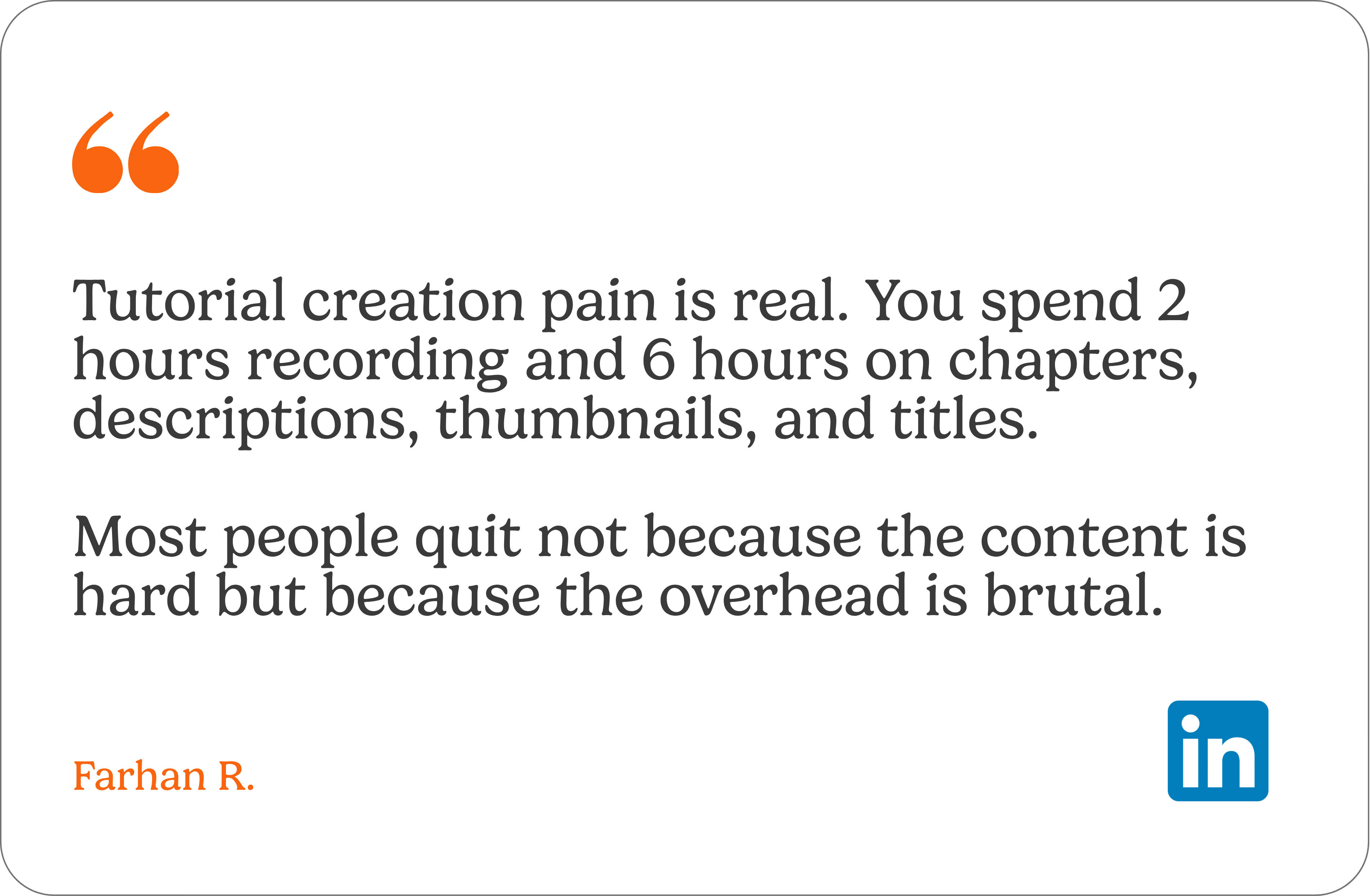
Fast forward to today, and it’s clear that pressure never really went away. If anything, it got heavier — more software built just for your industry, a growing list of AI products to try, and new tools that take hours to set up.
That weight is the whole reason this rebrand exists. Not because our old branding was broken, but because your job got heavier, and we wanted everything about Tango, not just the product, to feel lighter.
What you'll see
Reimagined flow
Our original ribbon motif was designed with the idea of “flow” in mind — one thing moving into the next, effortlessly and in sync. These new ribbons are built around the same idea and represent how it feels to use Tango — one person hands off what they know, so the whole team keeps moving. Every curve is designed to feel resolved — the same small, satisfying click as something slotting exactly into place. That's the standard we're holding the whole brand to — not just product.
.png)
Primary colors
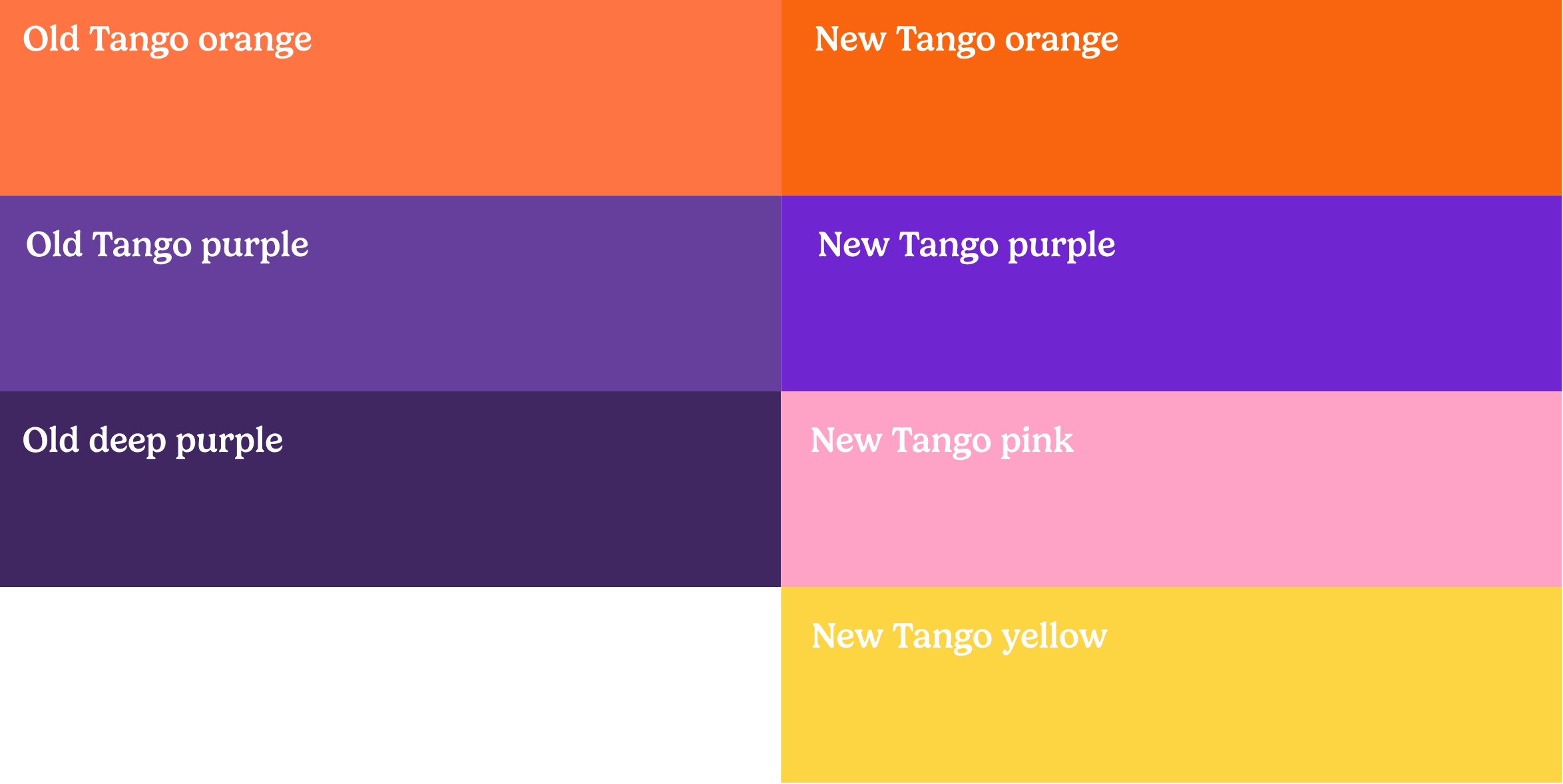
First, we turned our orange and purple up a notch for vibrancy. Then we layered in pink and yellow to add to the warmth and playfulness — something that's always existed in our brand.
Primary font
We swapped Tiempos for Gelica — a little bolder, a little more character, and built to hold its own next to our new illustration system.
.png)
A new homepage
We rebuilt the homepage around our customers, with approachability, confidence, and relief in mind.
.png)
This is what lighter feels like
This new look isn't the finish line. It's us doubling down on the real problem: making it easier for the person everyone turns to, so sharing what you know feels satisfying instead of another chore.
To everyone who’s already using Tango, thank you for growing with us. And if you're new here, we’re glad you found us! Either way, let us know what you think. We built this for you.

Next time someone asks, “how do I…?” Send a Tango.
Start capturing your first workflow today.